
Sphaer
Bridging local creativity with urban experience
I pitched this as our graduation project at Spiced Academy Berlin. Two goals drove everything: for residents to find what's happening around them in one place — and for creators to reach the right audience without the noise.
Case study
Timeline
03.2025 - 05.2025
Role
Concept · Research
Design system
Art direction
Skills
Product design user research
Prototyping
Team
Lara — research, personas, UX writing
Camila — research, wireframes
René — design system, prototype
01 — IDEA
Berlin has one of Europe's richest local cultures — yet discovering it still means navigating fragmented platforms, group chats, posters, and algorithms.
I designed SPHAER as a unified local platform where creators can share offerings, and residents can discover experiences, communities, and people around them — built around European values of privacy, place, and consent.
02 — Problem
A fragmented local experience
Creators struggle to reach the right audience without relying on Instagram or existing social circles. Residents struggle to discover local experiences beyond algorithms, word of mouth, or mainstream platforms. The result is a coordination gap: people want to participate more in local life — but existing tools make discovery and connection difficult.
03 — Research
6 residents. 13 creators. 2 sides of the same problem.
"In the past there was Zitty — one newspaper every two weeks, all the events. Now it's spread across too many platforms. Really uncomfortable."
— Frank, Resident from berlin
Research revealed
78%
Residents
miss out on local events regularly
"I always have the feeling that a lot escapes me." — Judi

34%
Residents
skipped activities rather than go alone
"The last time I didn't go was because nobody wanted to come with me." — Lisa
95%
Residents
trust personal recommendations
"Not having to jump between everything — one place where information flows." — Tim
62%
Creators
describe promotion as a second job
"It's like a job in itself — you'd almost need to hire someone." — Andrea
77%
Creators
want to reach beyond their immediate circle
"I want my offers to reach the right audiences — not just friends." — Leo
85%
Creators
Uses Instagram, even though they dislike it.
“There’s something sensitive about self-promotion on social media.”
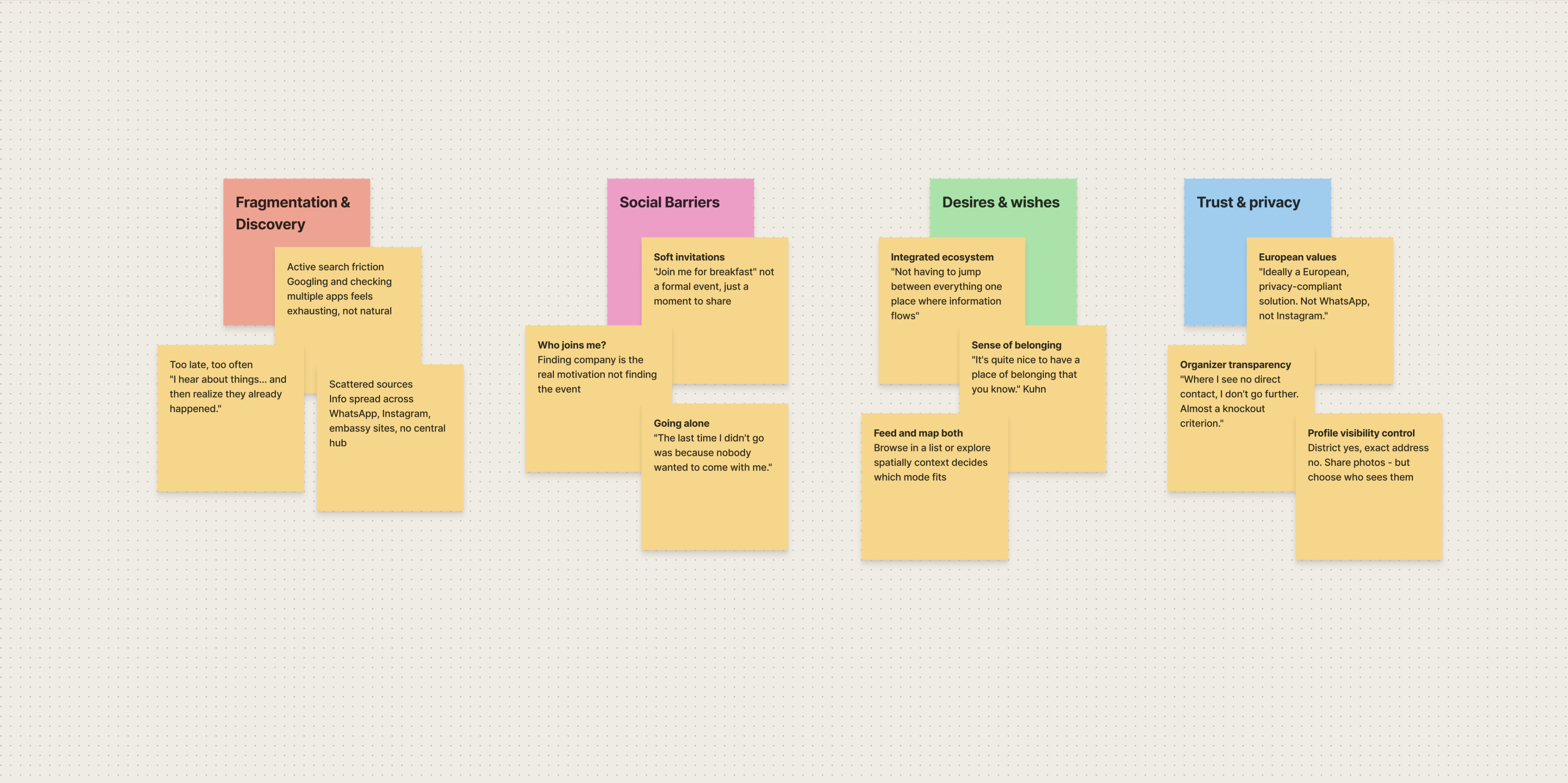
We weren't looking at a discovery problem. We were looking at a participation problem. Creators didn't lack talent — they lacked infrastructure. The tools forced a choice between too public and too private. Brilliant work went unseen.
03 — The Market
What existing platforms offer — and what they're missing
None connect discovery and creation in one place. None are built around European privacy values. That's the gap SPHAER fills.
Platform
Strength
Missing
Massive reach & visual promotion
No local focus or structured events
Meetup
Event discovery
No creator ecosystem
Fiverr/Upwork
Freelance marketplace & services
No community or local connections
Facebook Events
Wide event listing distribution
Privacy concerns & algorithm fatigue
nebenan
Hyperlocal neighborhood connection
Limited cultural & creator focus
rausgegangen
Cultural listings
No participation layer
Three questions shaped everything that followed:
"How might we make the platform useful before any network exists? How might we let people explore their city in the way that suits them best? How might we connect residents and creators without sacrificing privacy?"
03 — Who I Designed For
Residents can't find the right offers. Creators can't reach the right people.
The gap between them is where SPHAER lives.


Carl
the Explorer
Architect. Kreuzberg. Curious, busy, slightly disconnected from his own city. He wants to know what's happening around him workshops, screenings, community moments without spending an hour searching for it. He finds out too late. He goes alone or not at all.

Lea Weber
the Creator
Digital filmmaker. 11 years experience. She runs Collaborating On Set, a workshop for film crews on staying calm and creative under pressure. She wants to reach people who'd genuinely value her work. A structured space where sharing feels natural, not performative.
Their paths cross when Carl finds Lea's workshop in the feed and books it. That single moment is the entire product thesis made tangible.
One platform. Three intentions Discover what's happening around you. Belong to communities that match who you are. Share your work with the right people.
03 — Design Decisions
What I Built and Why Four Things That Matter The Thinking Behind It
1 · Discovery as a system
Feed for browsing. Map with walking distances. Mural — a horizontal wall of posters recreating walking past a Berlin Litfaßsäule. Every activity title should feel worth showing up for.
2 · Hick's Law in the search
Originally all category tags were visible at once. Too many choices creates paralysis. Solution: clean search bar categories appear only when you tap it. Options available when needed, invisible when not.
3 · Participation as invitation
The + button offers three choices — activity, circle, poster. Not ten. Creators get a dedicated space where sharing work feels legitimate, not performative.
4 · Privacy in the moment
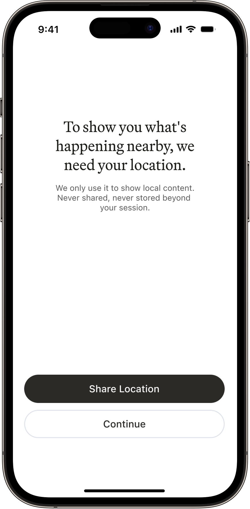
Location asked after sign-up, not before. No date of birth. Creators choose their audience before writing. Every field removed was a trust decision.
03 — The Design Language
The visual language is intentionally restrained. A black and white base across every screen — no competing colors, no decorative fills. The reasoning was simple: creators bring the color. Their posters, workshop images, and event covers are already rich and varied.
Color Palette
Text · buttons. active elements
Near Black
#2B2A27
Backgrounds
Pure White
#FFFFFF
Borders · inactive states
Light gray-blue
#E0E4EB
Secondary text · inactive labels
Mid gray
#949494
Links
Blue
#3572C7
Format
I chose portrait A-format for activity cards the same proportions as a physical poster. Creators already design posters for their events. On SPHAER, that poster becomes the card. No reformatting, no cropping. The content arrives exactly as intended.


Poster A-format
Circle cards use a circular image crop. One glance and you know whether you're looking at something happening or somewhere to belong.


Typography & Iconography
Headlines use ABC Arizona Mix Variable warm, editorial, every activity title feels worth showing up for. Body text and UI labels use SF Pro, clean, legible, native to iOS.
H1 - HEADLINE/Title . 22/Auto
Headline
H2 - HEADLINE/Title . 20/Auto
Headline
H3 - Headings/Body/CTA . 22/auto
Headline
H4 - Headings/CTA . 18/auto
Headline
H3 - Body . 14/auto
Headline
phosphor icons


Apple SF Symbols

03 — The Outcome
Two user types. Three content layers. Five decisions. One privacy-first European platform — designed as if it would launch.
03 — What I Learned
This project shifted my perspective from designing interfaces to designing social dynamics. What stood out most: participation depends on trust and context — not just access to information.
Sphaer
Bridging local creativity with urban experience
I pitched this as our graduation project at Spiced Academy Berlin. Two goals drove everything: for residents to find what's happening around them in one place — and for creators to reach the right audience without the noise.
Case study
Timeline
03.2025 - 05.2025
Role
Concept · Research
Design system
Art direction
Skills
Product design user research
Prototyping
Team
Lara — research, personas, UX writing
Camila — research, wireframes
René — design system, prototype
01 — IDEA
Berlin has one of Europe's richest local cultures — yet discovering it still means navigating fragmented platforms, group chats, posters, and algorithms.
I designed SPHAER as a unified local platform where creators can share offerings, and residents can discover experiences, communities, and people around them — built around European values of privacy, place, and consent.
02 — Problem
A fragmented local experience
Creators struggle to reach the right audience without relying on Instagram or existing social circles. Residents struggle to discover local experiences beyond algorithms, word of mouth, or mainstream platforms.
The result is a coordination gap: people want to participate more in local life — but existing tools make discovery and connection difficult.
03 — Research
6 residents. 13 creators. 2 sides of the same problem.
"In the past there was Zitty — one newspaper every two weeks, all the events. Now it's spread across too many platforms. Really uncomfortable."
— Frank, Resident from berlin
Research revealed
78%
Residents
miss out on local events regularly
"I always have the feeling that a lot escapes me." — Judi
34%
Residents
skipped activities rather than go alone
"The last time I didn't go was because nobody wanted to come with me." — Lisa
95%
Residents
trust personal recommendations
"Not having to jump between everything — one place where information flows." — Tim
62%
Creators
describe promotion as a second job
"It's like a job in itself — you'd almost need to hire someone." — Andrea
77%
Creators
want to reach beyond their immediate circle
"I want my offers to reach the right audiences — not just friends." — Leo
85%
Creators
Uses Instagram, even though they dislike it.
“There’s something sensitive about self-promotion on social media.”
We weren't looking at a discovery problem. We were looking at a participation problem. Creators didn't lack talent — they lacked infrastructure. The tools forced a choice between too public and too private. Brilliant work went unseen.
03 — The Market
What existing platforms offer — and what they're missing
None connect discovery and creation in one place. None are built around European privacy values. That's the gap SPHAER fills.
Platform
Strength
Missing
Massive reach & visual promotion
No local focus or structured events
Meetup
Event discovery
No creator ecosystem
Fiverr/Upwork
Freelance marketplace & services
No community or local connections
Facebook Events
Wide event listing distribution
Privacy concerns & algorithm fatigue
nebenan
Hyperlocal neighborhood connection
Limited cultural & creator focus
rausgegangen
Cultural listings
No participation layer
Three questions shaped everything that followed:
"How might we make the platform useful before any network exists? How might we let people explore their city in the way that suits them best? How might we connect residents and creators without sacrificing privacy?"
03 — Who I Designed For
Residents can't find the right offers. Creators can't reach the right people.
The gap between them is where SPHAER lives.
Carl
the Explorer
Architect. Kreuzberg. Curious, busy, slightly disconnected from his own city. He wants to know what's happening around him workshops, screenings, community moments without spending an hour searching for it. He finds out too late. He goes alone or not at all.
Lea Weber
the Creator
Digital filmmaker. 11 years experience. She runs Collaborating On Set, a workshop for film crews on staying calm and creative under pressure. She wants to reach people who'd genuinely value her work. A structured space where sharing feels natural, not performative.
Their paths cross when Carl finds Lea's workshop in the feed and books it. That single moment is the entire product thesis made tangible.
One platform. Three intentions Discover what's happening around you. Belong to communities that match who you are. Share your work with the right people.
03 — Design Decisions
What I Built and Why Four Things That Matter The Thinking Behind It
1 · Discovery as a system
Feed for browsing. Map with walking distances. Mural — a horizontal wall of posters recreating walking past a Berlin Litfaßsäule. Every activity title should feel worth showing up for.
2 · Hick's Law in the search
Originally all category tags were visible at once.
Too many choices creates paralysis. Solution: clean search bar categories appear only when you tap it. Options available when needed, invisible when not.
3 · Participation as invitation
The + button offers three choices — activity, circle, poster. Not ten. Creators get a dedicated space where sharing work feels legitimate, not performative.

4 · Privacy in the moment
Location asked after sign-up, not before. No date of birth. Creators choose their audience before writing. Every field removed was a trust decision.
03 — The Design Language
The visual language is intentionally restrained. A black and white base across every screen — no competing colors, no decorative fills. The reasoning was simple: creators bring the color. Their posters, workshop images, and event covers are already rich and varied.
Color Palette
I chose not to use a primary brand color. Five neutrals structure the entire interface near black, pure white, a cool off-white background, subtle borders, and secondary gray. The reasoning was simple: the content brings the color. Creator posters, event photography, and workshop covers are already visually rich. A quiet UI lets them breathe.
Text · buttons. active elements
Near Black
#2B2A27
Backgrounds
Pure White
#FFFFFF
Borders · inactive states
Light gray-blue
#E0E4EB
Secondary text · inactive labels
Mid gray
#949494
Links
Blue
#3572C7
Format
I chose portrait A-format for activity cards the same proportions as a physical poster. Creators already design posters for their events. On SPHAER, that poster becomes the card. No reformatting, no cropping. The content arrives exactly as intended.
Poster A-format
Circle cards use a circular image crop. One glance and you know whether you're looking at something happening or somewhere to belong.
Typography & Iconography
Headlines use ABC Arizona Mix Variable warm, editorial, every activity title feels worth showing up for. Body text and UI labels use SF Pro, clean, legible, native to iOS.
H1 - HEADLINE/Title . 22/Auto
Headline
H2 - HEADLINE/Title . 20/Auto
Headline
H3 - Headings/Body/CTA . 22/auto
Headline
H4 - Headings/CTA . 18/auto
Headline
H3 - Body . 14/auto
Headline
phosphor icons
Apple SF Symbols


03 — The Outcome
Two user types. Three content layers. Five decisions. One privacy-first European platform — designed as if it would launch.
03 — What I Learned
This project shifted my perspective from designing interfaces to designing social dynamics. What stood out most: participation depends on trust and context — not just access to information.

Sphaer
Bridging local creativity with urban experience
I pitched this as our graduation project at Spiced Academy Berlin. Two goals drove everything: for residents to find what's happening around them in one place — and for creators to reach the right audience without the noise.
Case study
Timeline
03.2025 - 05.2025
Role
Concept · Research
Design system . Art direction
Skills
Product design . user research
Prototyping
Team
Lara — research, personas
UX writing
Camila — research, wireframes
René — design system, prototype
01 — IDEA
Berlin has one of Europe's richest local cultures — yet discovering it still means navigating fragmented platforms, group chats, posters, and algorithms.
I designed SPHAER as a unified local platform where creators can share offerings, and residents can discover experiences, communities, and people around them — built around European values of privacy, place, and consent.
02 — Problem
A fragmented local experience
Creators struggle to reach the right audience without relying on Instagram or existing social circles. Residents struggle to discover local experiences beyond algorithms, word of mouth, or mainstream platforms.
The result is a coordination gap: people want to participate more in local life — but existing tools make discovery and connection difficult.
03 — Research
6 residents. 13 creators. 2 sides of the same problem.
"In the past there was Zitty — one newspaper every two weeks, all the events. Now it's spread across too many platforms. Really uncomfortable."
— Frank, Resident from berlin
Research revealed
78%
Residents
miss out on local events regularly
"I always have the feeling that a lot escapes me." — Judi
34%
Residents
skipped activities rather than go alone
"The last time I didn't go was because nobody wanted to come with me." — Lisa
95%
Residents
trust personal recommendations
"Not having to jump between everything — one place where information flows." — Tim
62%
Creators
describe promotion as a second job
"It's like a job in itself — you'd almost need to hire someone." — Andrea
77%
Creators
want to reach beyond their immediate circle
"I want my offers to reach the right audiences — not just friends." — Leo
85%
Creators
Uses Instagram, even though they dislike it.
“There’s something sensitive about self-promotion on social media.”
We weren't looking at a discovery problem. We were looking at a participation problem. Creators didn't lack talent — they lacked infrastructure. The tools forced a choice between too public and too private. Brilliant work went unseen.
03 — The Market
What existing platforms offer — and what they're missing
None connect discovery and creation in one place. None are built around European privacy values. That's the gap SPHAER fills.
Platform
Strength
Missing
Massive reach & visual promotion
No local focus or structured events
Meetup
Event discovery
No creator ecosystem
Fiverr/Upwork
Freelance marketplace & services
No community or local connections
Facebook Events
Wide event listing distribution
Privacy concerns & algorithm fatigue
nebenan
Hyperlocal neighborhood connection
Limited cultural & creator focus
rausgegangen
Cultural listings
No participation layer
Three questions shaped everything that followed:
"How might we make the platform useful before any network exists? How might we let people explore their city in the way that suits them best? How might we connect residents and creators without sacrificing privacy?"
03 — Who I Designed For
Residents can't find the right offers. Creators can't reach the right people.
The gap between them is where SPHAER lives.
Carl
the Explorer
Architect. Kreuzberg. Curious, busy, slightly disconnected from his own city. He wants to know what's happening around him workshops, screenings, community moments without spending an hour searching for it. He finds out too late. He goes alone or not at all.
Lea Weber
the Creator
Digital filmmaker. 11 years experience. She runs Collaborating On Set, a workshop for film crews on staying calm and creative under pressure. She wants to reach people who'd genuinely value her work. A structured space where sharing feels natural, not performative.
Their paths cross when Carl finds Lea's workshop in the feed and books it. That single moment is the entire product thesis made tangible.
One platform. Three intentions Discover what's happening around you. Belong to communities that match who you are. Share your work with the right people.
03 — Design Decisions
What I Built and Why Four Things That Matter The Thinking Behind It
1 · Discovery as a system
Feed for browsing. Map with walking distances. Mural — a horizontal wall of posters recreating walking past a Berlin Litfaßsäule. Every activity title should feel worth showing up for.
2 · Hick's Law in the search
Originally all category tags were visible at once.
Too many choices creates paralysis. Solution: clean search bar categories appear only when you tap it. Options available when needed, invisible when not.
3 · Participation as invitation
The + button offers three choices — activity, circle, poster. Not ten. Creators get a dedicated space where sharing work feels legitimate, not performative.
4 · Privacy in the moment
Location asked after sign-up, not before. No date of birth. Creators choose their audience before writing. Every field removed was a trust decision.
03 — The Design Language
The visual language is intentionally restrained. A black and white base across every screen — no competing colors, no decorative fills. The reasoning was simple: creators bring the color. Their posters, workshop images, and event covers are already rich and varied.
Color Palette
I chose not to use a primary brand color. Five neutrals structure the entire interface near black, pure white, a cool off-white background, subtle borders, and secondary gray. The reasoning was simple: the content brings the color. Creator posters, event photography, and workshop covers are already visually rich. A quiet UI lets them breathe.
Text · buttons. active elements
Near Black
#2B2A27
Backgrounds
Pure White
#FFFFFF
Borders · inactive states
Light gray-blue
#E0E4EB
Secondary text · inactive labels
Mid gray
#949494
Links
Blue
#3572C7
Format
I chose portrait A-format for activity cards the same proportions as a physical poster. Creators already design posters for their events. On SPHAER, that poster becomes the card. No reformatting, no cropping. The content arrives exactly as intended.
Poster A-format
Circle cards use a circular image crop. One glance and you know whether you're looking at something happening or somewhere to belong.
Typography & Iconography
Headlines use ABC Arizona Mix Variable warm, editorial, every activity title feels worth showing up for. Body text and UI labels use SF Pro, clean, legible, native to iOS.
H1 - HEADLINE/Title . 22/Auto
Headline
H2 - HEADLINE/Title . 20/Auto
Headline
H3 - Headings/Body/CTA . 22/auto
Headline
H4 - Headings/CTA . 18/auto
Headline
H3 - Body . 14/auto
Headline
phosphor icons
Apple SF Symbols
03 — The Outcome
Two user types. Three content layers. Five decisions. One privacy-first European platform — designed as if it would launch.
03 — What I Learned
This project shifted my perspective from designing interfaces to designing social dynamics. What stood out most: participation depends on trust and context — not just access to information.